
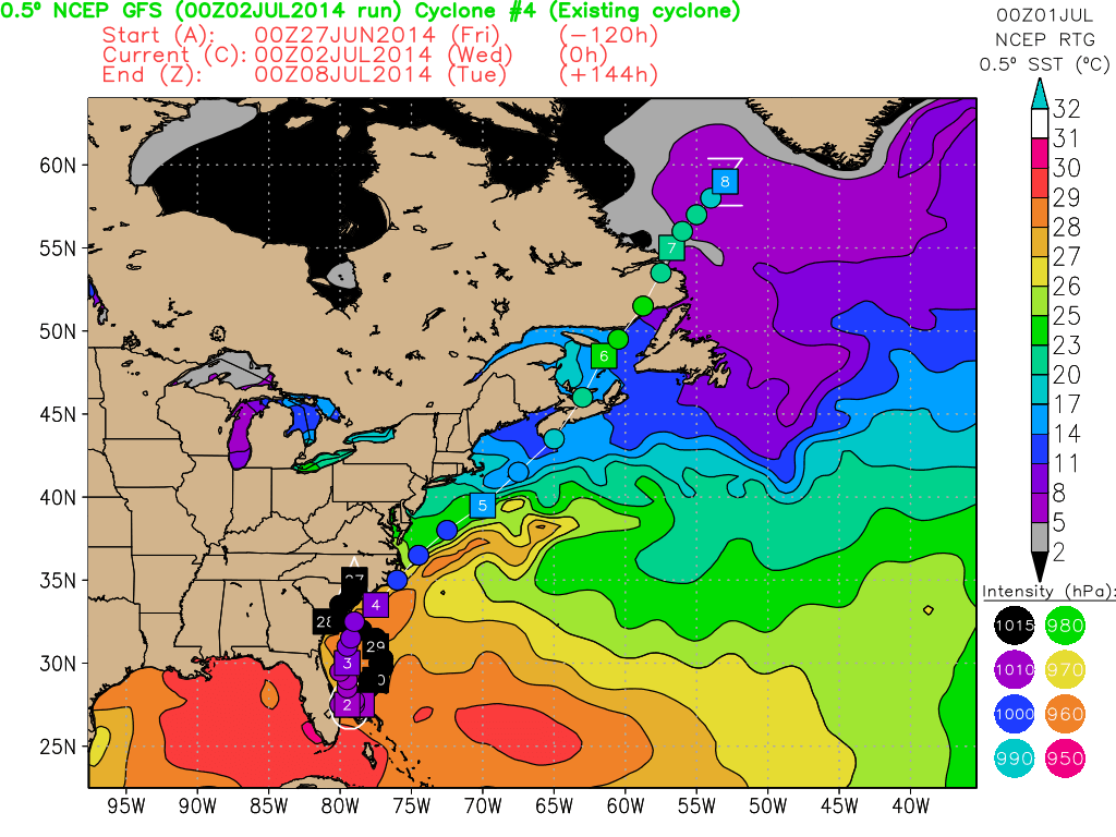
There’s a lot packed into the map at the top of this entry (click for a larger view). Don’t be overwhelmed. It’s pretty easy and I’ll break it down.
What you’re looking at is a history and prediction of Tropical Storm Arthur. This is based on the GFS, not usually a great hurricane model, but this isn’t a particularly tough forecast.
Hopefully you see the Eastern US and Canada. The colored areas represent ocean water temperature. It’s done in degree Celsius.
Arthur is in an orange area corresponding to 28°-29° Celsius. That’s basically the low 80s° Fahrenheit. Up to North Carolina there is relatively warm water. North of that water cools rapidly. Off Cape Cod it’s 17°-20° Celsius or mid-60s° Fahrenheit.
That colder water will quickly shut down the tropical characteristics of any early season storm. Arthur, interacting with a front, will be more a rain than wind maker for most of the Eastern Seaboard. The brunt will be felt in the Northeast Friday, what looks like a pretty crappy day.
The boxed numbers with balls in between forming a line is the storm’s track. The number in the box is the date. You’ll notice they’re bunched up around Florida, but spread out beyond the 4th of July. That shows the storm’s forward motion increasing rapidly.
The faster the forward motion, the easier the track is to predict! That’s one reason I’ve been so blase about this storm’s chances of impacting the Northeast. It’s fast moving and very likely to stay offshore.
Thanks to Dr. Robert Hart of Florida State University for providing the map (I actually haven’t asked him yet, but he won’t say no.)
